HUGGIES
Lead the wipes category online
The Challenge
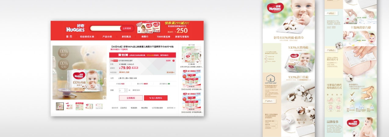
Huggies has launched one of the very first dry wipes in China to shake a very competitive market. Safer than wet wipes and tissues, more convenient than clothes and tissues, this innovation is exclusively sold online. How to trigger the interest and communicate the product superiority online?
Our Brand Idea
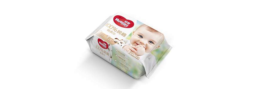
Which mother has never feared to see her baby dropping its teat, or putting his hands into his mouth? A specific visual has been selected to dramatize this consumer insight on the packaging and ensure maximum emotional impact on the e-shelf. The packaging is also enhancing the selling proposition with a large '100% pure cotton' indication and warm earthy colors.
The Result
Huggies dry diapers has become one of the best-selling products on Huggies e-commerce platform, and the one with most positive comment generators.
HUGGIES
Bring naturalness into babycare
The challenge
Wet wipes are the unmissableaccessory in babycare. Yet, mothers are more and more demanding when it comes to quality and safety of everything that touches the skin of their beloved little ones. How to better reveal the product natural competitive edge and invite mothers to upgrade their choice?
Our brand idea
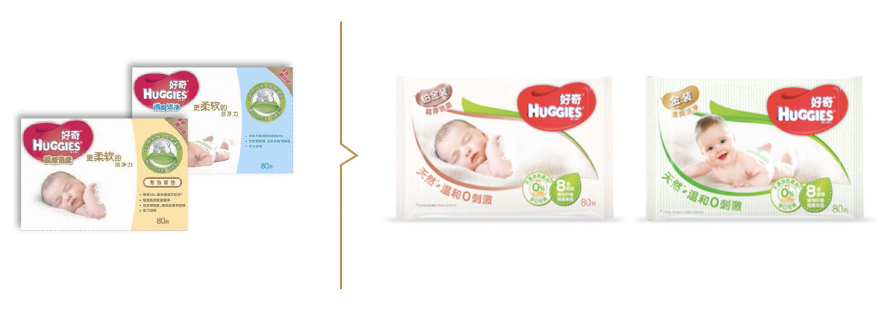
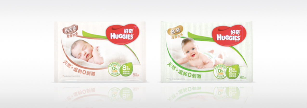
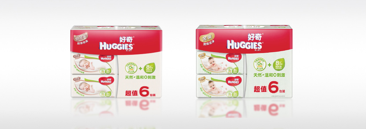
the new packaging of Huggies wet wipes leverage codes of naturalness as a selling proposition, but also as a softness benefit and an usage sensation, combining a strong 'leaf' symbolic framing the baby visual, with earthy colors, fabric texture pattern and sewing points graphics locking the reason-to-believe icon. On the back panel, graphics have been developed to educate the mother on the usage and the added-value they could get by upgrading their choice.
The result
Huggies wet wipes sales have been significantly revitalized after the upgrade was released.
HUGGIES
Enhance premiumness and segmentation
The challenge
In a very competitive market, how to increase the value perception, while helping the consumer to identify and navigate within the segmentation ?
Our brand idea
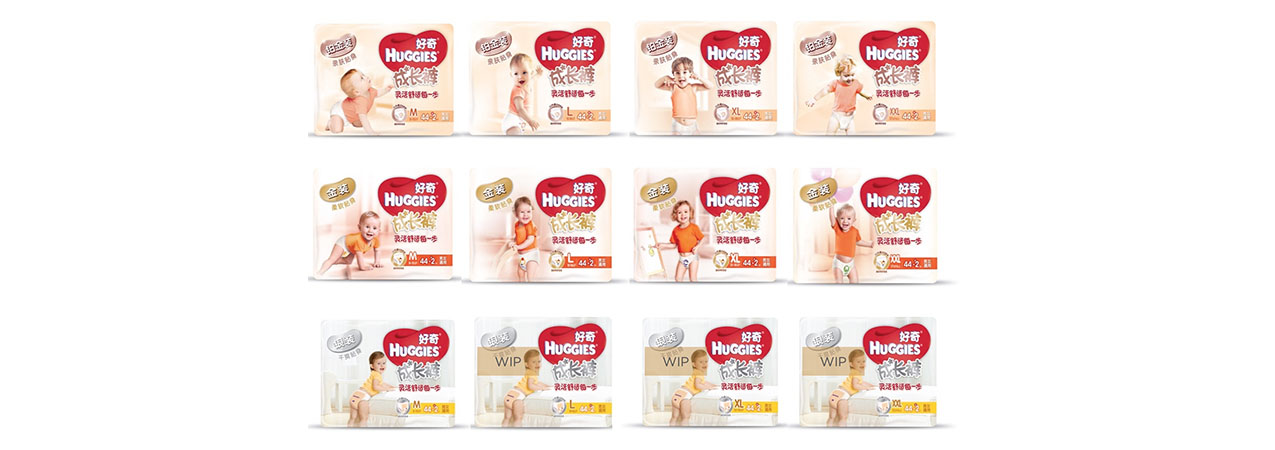
Functional benefits are not all. Therefore, we have brought back emotional cues and the heart-shaped logo into the packaging design, while clarifying the segmentation codes. One color for one segment. One baby in motion for one size. Two versions of teddy bears with a relevant action for one type of diaper. To dramatize the benefit of softness and lightness, we have selected skin-color shades for the main segmentation, developed specific functional icons and very structured back panel, and created a unique promotional key visual.
The result
This packaging redevelopment has allowed to increase the unit price slightly and protect the sales volume.

HUGGIES
Create the exception
The challenge
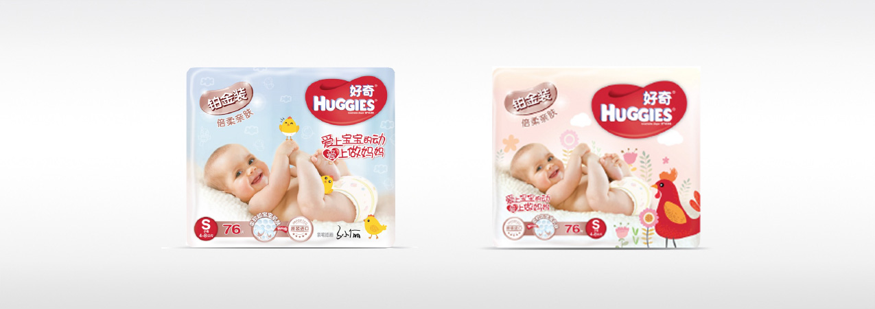
Chinese mothers always want to offer the very best to their babies. If it can also break the daily routine, or make it more unique, what else to expect to build-up brand preference or attract new consumers ?
Our brand idea
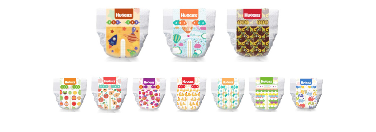
A first partnership was set-up with Sun Li, a mother and actress celebrity, who realized by herself some simple drawings inspired by the Roaster Chinese New Year, that have been dramatized into a limited edition box design. A second partnership was set-up with a the Chinese jewelry designer Hefang. Using her patterns and creating new ones in the same mood, we have developed a series of trendy out-cover designs for the most premium Huggies diaper range.
The result
Successful buzz and promotions have been created around each of these events, driving the sales volume.
