BAYER KANG WANG
Rejuvenate an established leading brand
The challenge
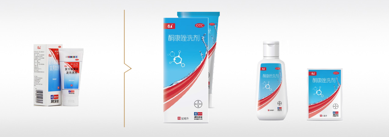
Kang Wang is a medicated shampoo which reputation of efficacy has been very well established for many years. Sold in pharmacy channel, Bayer has decided to expand the footprint of the Brand to attract unsatisfied FMCG users looking for a more efficient solution to solve their immediate problems of dandruff and itchiness. How to communicate the idea of effectiveness, without rising the perception of harmfulness usually inherent to medicine?
Our brand idea
The fundamental Brand color codes were kept and enriched to increase the premium-ness of the Brand. Color blockings were created to increase the shelf impact. The graphic focused on delivering the idea of deep cleaning efficacy to inject FMCG cues (water splash and hair-shape divider), combined with the one medical efficacy (scientific icon and white color blocking).
The result
The brand manages to capture progressively FMCG users, while re-attracting the traditional consumers of Kang Wang, who both perceived it more modern, premium and professional.

BAYER DIHON
Create an ambitious brand architecture system
The challenge
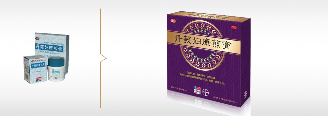
In 2014, German Bayer acquired Yunnan’s Dihon Pharmaceuticals with the ambition to enrich its portfolio of OTC brands, and to create Bayer’s first ever TCM brand. The decision was made to regroup different brands and products, covering different needs, under one same Yunnan’s TCM mega-brand, Dihon. How to communicate the uniqueness of Yunnan & TCM value proposition and trade-up the premiumness of the mega brand ?
Our brand idea
An efficient packaging system was created with a powerful brand lock-up devise, inspired by the nature and unique Yunnan ethnic style, combined with contemporary segmentation colors, traditional fonts, golden hot stamping printing effects, allowing to create brand consistency, portfolio navigation, and shelf impact.
The result
The brand has been successfully launched in targeted online channels (like DaYiMa) before being rolling out. In terms of consumer perceptions, the new packaging has allowed the Brand to significantly improve its professional and premium image.


